Hey everyone!
I'm back again, this time with the mid month challenge at Let's Get Sketchy!
This is the May 15th challenge and we have a fabulous sketch for you!

Here is my interpretation of the sketch.....

My inspiration for this layout was the large horizontal photo. The cup stains also drew me to create a masculine page so when rummaging through some photos I had printed off ready this one of DS seemed the perfect choice.
There is no real colour in the photo so didn't want to overpower the photo by adding any, my aim was to still let the photo pop from the layout so monochrome beiges and browns was the way forward.
The thought of doing a masculine page to some of us girlies who love their floral shabby chic layouts can be rather a headache, but I think with a masculine layout it is about being clever by using different textures and surfaces and the things we adhere our layers and pages with. I will show you a few ideas as we go through the close up photos.

I love the angle of this photo, which is why I take them, because it shows the definition of the layout and how the embellishments are layered up rather then just showing a 'flat' layout.

I used a 'splats' stencil with a Pan Pastel to create my splats. I love my pan pastels as something different to use. I haven't used them for a while but now I've got the box out I'm sure they are going to get used a lot again! They give a lovely mat chalk look, and can give a great different background to a masculine layout.
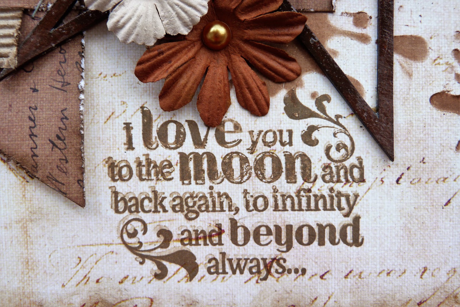
The stamp I used was a rubber stamp from a collection by Die'sire. I inked it with Archival Coffee Ink. I say this quote a lot to my kids so its very apt it should appear on one of my scrapbook pages of my kids.

I used a stapler to attach my layers together, a practical use but also an additional visual embellishment great for masculine pages. I used washi tape here as well as the sketch used washi tape. Another great way to add extra detail on a masculine layout. As always distressed edges work on all layouts and you very rarely see one of my layouts without distressed edges, I just love them! I use a Prima distresser which has a range of distress levels although I do use the heaviest one most of the time!

I'm loving my straws at the moment! These straws I have cut into two, so they go further, and poked them into my embellishment cluster.
Talking of textures earlier, I have used some corrugated card as part of my layers, again the edges are distressed and then I have inked the edges and run the foam pad I inked with over the top of the ridges to exaggerate the ridges.

Now here is another of my 'favourite of the moment' items I have been using - the Viva Inka Gold.
The music notes chipboard I painted with the Folk Art paint and then rubbed over with the Inka Gold to give a great effect.

The Star chipboard piece was painted with the Raw Umber paint and then covered with the crackle glaze. It didn't crackle as much as I would have liked but it has a nice glossy finish and adds a different surface to the layout. I cut the star into two pieces so I could balance a piece each side of my layout.

So there's nothing that says you can't use flowers on a masculine page, I just try to use neutral natural colours that blend in with the colour scheme and act as a frame to highlight the photo.
The flowers are petal layers which I have layered up and finished off with a variety of pearls and crystal finishes with the really nice focal flower with the button from Pink Paislee.
I have done a SNAPGUIDE TUTORIAL for this layout to further show you how to use the products shown. Please follow this link below to view:
Products used on this layout:
* Prima Marketing: Ledger 12x12 pad: script paper
* Prima Marketing: Princess A4 pad
* Prima Marketing: Flowers & Chipboards: Alphas & flowers #525255
* BoBunny: Double Dot Jewels: Mocha
* Pink Paislee: Fetching Petals: 00170
* Dusty Attic: Stencil: Splats DA1329
* Pan Pastel: artist pastel: Burnt Sienna
* Ranger:Archival Ink: Coffee
* Crafter's Companion: Die'sire Stamps: Love is all you need
* Tim Holtz: Washi Tape
* Tim Holtz: Distress Ink: Walnut Stain
* Corrugated Card
* Kaisercraft: Acrylic Paint: Raw Umber
* Folk Art: Acrylic Paint: Real Brown
* Live & Love Crafts: Straws: brown stripe x2
* Stapler
* Americana Décor: Crackle Medium
* Viva: Inka Gold: Old Gold
*Tando Creative: Minis Lasercut Board: Music
* Southern Ridge Trading Co. : Diecuts: Star
Thanks for taking a look at my layout!
Ginny :)

No comments:
Post a Comment